Data visualization and reporting with Power BI
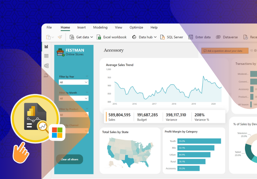
in Data Analytics with Microsoft Power BIWhat you will learn?
Explore reporting and dashboard design principles, learning how to develop visually appealing and effective reports.
Understand the process of report development in Power BI and learn tips and tricks for designing exceptional reports.
Learn how to choose appropriate charts and colors for data visualization, incorporating best practices for consistency, contrast, and accessibility.
Familiarize yourself with modern features in Power BI, including tooltips, buttons, drillthroughs, bookmarks, and field parameters.
Apply your acquired skills through hands-on guided projects and a final capstone project, focusing on performing competitive analysis on operational performance.
Learn how to share reports with stakeholders via Microsoft Teams, PDFs, and Power BI integration with PowerPoint for effective data storytelling.
Build practical experience and enhance your reporting and visualization skills through the completion of multiple guided projects.
About this course
Data visualization and reporting with Power BI course is designed to provide participants with a comprehensive understanding of the diverse range of visualizations available in Power BI and how to effectively use them to solve specific data analysis challenges. Additionally, participants will learn how to design visually appealing reports, format them for enhanced clarity, and utilize report navigation techniques to create compelling data-driven narratives.
Throughout this course, participants will delve into the extensive library of visuals offered by Power BI and gain a deep understanding of when and how to use each visual to address different types of data analysis problems. You will learn the principles of data visualization best practices, enabling you to design engaging and impactful visuals that effectively communicate complex information to stakeholders.
The course emphasizes report design and formatting techniques to ensure that reports are visually appealing and easy to comprehend. We will explore various layout options, color palettes, and typography choices to create visually cohesive and aesthetically pleasing reports. We will also learn how to use formatting options to emphasize key insights and improve the overall user experience.
In addition to visual design, participants will master the art of report navigation in Power BI. They will learn how to structure reports effectively, organize visualizations, and create intuitive navigation paths that guide users through the data story. Participants will discover techniques to create interactive features such as drill-through actions, bookmarks, and report tooltips, allowing users to explore data in a self-directed manner and uncover deeper insights.
The course also covers the concept of dashboards in Power BI, which empower users to target specific report visuals that meet their unique requirements. Participants will learn how to design and publish dashboards, selecting and arranging visuals to provide an at-a-glance view of key metrics and KPIs. They will explore techniques to filter and interact with data within dashboards, enabling users to focus on relevant information and make informed decisions quickly.
Throughout the course, participants will engage in hands-on exercises and real-world scenarios, applying their knowledge to practical projects and data sets.
By the end of the course, participants will possess the skills and expertise to leverage Power BI's exceptional visuals, design visually appealing reports, navigate effectively through data stories, and create impactful dashboards and reports that drive data-driven decision-making.
Note: This course assumes participants have a basic understanding of Power BI and familiarity with data analysis concepts.
FAQ
Comments (0)
Download the exercise file and practice along with the tutorials.
The world of color is far-ranging and seemingly boundless — which is why we’ve created a cheat sheet of essential terms and concepts to expand your knowledge.
