Transform your career with Data and AI skills

.png)
Live Bootcamps
10+ Cohort-based and instructor-led bootcamps

Guided Project
Build your skills with guided and interactive projects.

Self-paced courses
Access 30+ premium courses on demand.

Skills assessments
Access 10+ skills test and validate your skills.
Newest Courses
#Recently published courses


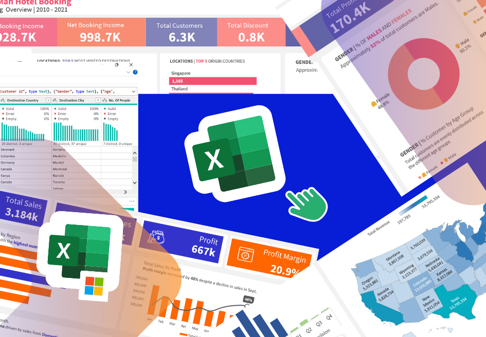
Data Analytics with PivotTables and Charts
Master PivotTables for analytics and reporting. Learn how to analyze and visualize data leveraging the power ob PivotTables and Charts.

Data Science and Analytics Fundamentals
If you're interested in a career in data analytics, this course is the perfect place to start. You'll learn about the different types of data analyti...

Data Transformation in Power BI
Data Analytics and Reporting with Microsoft Power BI
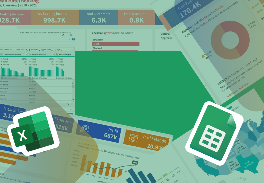
Excel Skills for Data Analytics
Clean, analyze and visualize data like a pro in this beginner-friendly Excel course. Master formulas, charts, & essential tools. No experience needed!
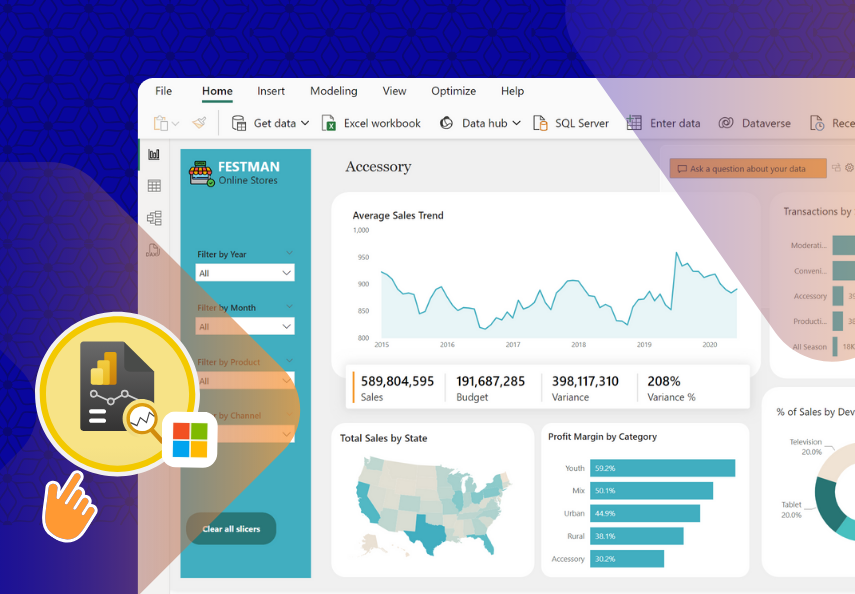
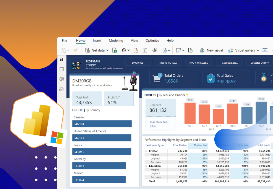
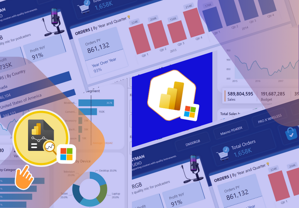
Data visualization and reporting with Power BI
Learn how to design amazing reports and dashboards using Microsoft Power BI.
10days to Modern Dashboard Design with Power BI
30mins Daily Bit-size Micro Learning: Create Effective and Engaging Power BI Dashboards with Modern UX
Latest bundles
Latest bundles subtitle
Business Intelligence Analyst in Power BI
Fast-track your career as a Microsoft Power BI Data analyst– no experience needed
Data Analyst in Microsoft Excel
This is your path to a career in data analytics. Master Microsoft Excel for Data analytics and reporting.
Free Courses
#Never miss free learning opportunities
Data Science and Analytics Fundamentals
If you're interested in a career in data analytics, this course is the perfect place to start. You'll learn about the different types of data analyti...
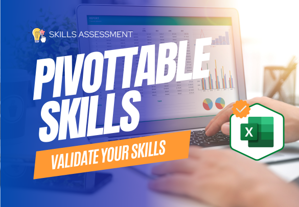
Excel PivotTable Skills Assessment
Certify Your Excel PivotTable Proficiency: Prove Your Skills with a Practical Assessment and Earn a Badge and Certificate!
Discounted Courses
#Get courses at the latest price
.png)
Project: Financial Analytics with Power BI
Learn how to design interactive financial analysis Dashboard with Microsoft Power BI.
 (1920 × 900 px).svg)
Blog
#Explore latest news and articles
 18 Nov 2023
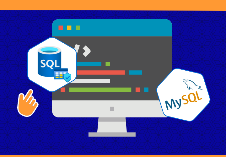
The SQL Create Statement
 29 Oct 2023
LinkedIn Branding for Data professionals
 18 Oct 2023
Data Engineer Career Spotlight

18 Weeks Business Intelligence and Data Analytics
.png)
Learn advanced Excel, Power BI, SQL and AI. Become a Business Intelligence Analyst or Data Analyst.